Question 7: Looking back at your preliminary task, what do you feel you have learnt in the progression from it to the full product?


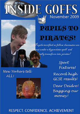
Looking back on my preliminary coursework I feel that I have learnt a lot. Mainly I've learnty to use one large main image on a front cover rather than several smaller images, each indivdual image recieves equal amount of attention, nothing really grabs the readers attention. The larger the image the less block colour is visible. I've learnt that it doesn't take much to make one colour look more interesting by using the gradient tool, this added element on my cover would grab slightly more attention. Another problem with the colours on the cover are that they all blend in and they are boring. I've learnt that the layout would look better with the title of the main article going across the image and the page rather than down the side of it on two seperate lines. If I had done this the image could be larger also on this part of the page I accidently saved the file into a JPG while some of the text was hidden behind one of the images. Therefore I have learnt to save the file in a JPG is I think it's finished as well as saving it as a PSD so if any mistakes were spotted I could correct them. This did happen with the final product the last digit of the date went off the page and the file was saved in a JPG so I had to cut and paste the background which was a long process just to change one detail. The colour of the text down the right hand side of the page could have done with being in more interesting colours, even alternating colours to attract more attention.
I've learnt to cut images out much better, after the creation of these, a good way I learnt to do it was to use the eraser tool that doesn't just erase the background but can also erase layers, this came in really useful. I've learnt to piece pieces of the cover together better than just listing them for example "New Yorkers Tell All" doesn't look as thought its with the image which it should look as they are part of the same article. One other thing that I learnt, is to print the date much smaller. An item I am fond of on the cover is the positioning and font of 'Respect. Confidence. Achievement.' It represents our school well along with the schools motif, this is good in my opinion as the idea of the coursework was to design a magazine for your school. I feel I have progressed far from this piece of work to my final product.
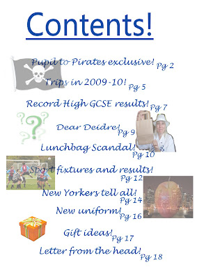
I personally don't mind my contents page, I like the idea I had of listing the contents down the centre of the page with the page numbers next to them, however this will only really work with little contents otherwise the size of the font would have to be decreased to fit it all in. The overall look of the page is too faded, this was because some of the text overlapped the images so I decided to fade all the pictures to keep the look consistant. The editing around one particular image on this page is poor, but now I feel that I am more confident and able to edit around images. Also the idea was to take photographs yourself but I used the internet for a couple, which in practise if this was my actual marked coursework would have been deducted marks.
Overall I feel I have come along way from the beginning of the course to the end. I've learnt the ins and outs of photoshop, technology involved in making the product such as saving work in many places, on memory sticks, Macs at school and computer/laptop at home.

No comments:
Post a Comment