
IDEAS 3: This idea is similar to the first idea.
Masthead: ME (Musical Evolution) the name centre on each individual, making them selves’ feel more important an boosts self-esteem. It’s similar to the NME style acronym, which may confuse readers. The style of music will be similar so disappoint may come from dedicated NME readers who may feel this new magazine is trying to over ride the existing mag. It represents my audiences taste in music. Just like the letter from the editor in Kerrang! It personalizes the magazine.
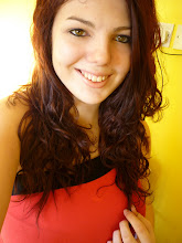
IMAGE: Will be a mid-shot of my model, wearing dark eyeliner and red lipsticks they contrast each other well. Depending on the pose chosen the colour of lipstick maybe dulled down a little so the eyes grab more attention she will have messy hair representing the rocker image. Also she will be wearing a deep plunge line top revealing her cleavage.
COLOUR SCHEME: Black and green. The first band I think of with the colour black and green are GreenDay. Black is a basis colour it contrasts well with any other colour it symbolises style, power and sophistication. Green represents growth and being new or in experienced which is ideal for the content of promoting up- coming bands. Also represents youth and good luck. These colours are good to use as they do contrast well, they are striking and eye catching.
DESIGN: The masthead will be ME! And be in the centre of the top of the cover. For a new magazine I want my readers to familiarise with the company before following other existing magazines and cover some of the masthead with an image. There will be one main image taking up 70% of the cover slightly off centre, more to the right. The image will be on a background from London, such as Camden Market, it’s an exciting location. Along the left hand side will be neat line up of boxes alternating colours green and black. Each pug will contain something that will feature inside the magazine. They will include main articles as well as sub articles along with a few pictures. There will be a ‘NEW!’ in the top left hand corner to show the audience it’s a new magazine. As well as ‘Issue NO. 1 and the date.
LANGUAGE: Just like the other magazine ideas, the language is going to involve a slight bit of simple slang to show the audience that the magazine is current and up to date with the times. Which will appeal to the audience, it will not be patronising or incredibly grammatically correct, as I feel that this detracts from the over all image of ‘Rock n Roll’.
I like this idea for my front cover, it will be easy to create the predominant image. The style with the neat boxes does not reflect my target audience of being messy teenagers.
No comments:
Post a Comment