
MASTHEAD: My first idea for my masthead is Launch, this is because its eye catching and you can emphasize the name. According to the dictionary it is said to be used to set something off for the first time to the public ‘launch the new perfume’ but in this case it would be to launch a new band, as a large proportion of the magazine will be filled with undiscovered bands trying to break into the market. Following conventions of other mainstream, or in fact nearly every magazine the masthead will be along the top of the magazine. This position has been used for a long time. When on the shelves the top of the magazine is always visible on the racks, drawing peoples attention.
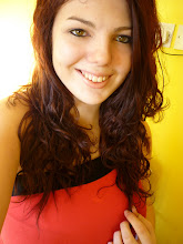
IMAGE: A friend covered in eyeliner, quite pale skin, simple lip-gloss so doesn’t take attention away from her eyes which will be looking deep into the camera in a trance sort of pose with lips pressed together, or bright red lipstick as its st
riking a passionate colour also represents danger, which can connote it’s dangerous to think you have a chance with her, or she’s drawn to danger which makes her more appealing to those rockers who ‘live on the edge’. Her outfit is undecided at the moment but it will be kept simple with dark colours keeping to the rock image, as well as being a sexy colour, its dark and mysterious. Which makes the reader be intrigued to who this girl is, I’m using a girl model as my magazine targets both the male and female audience, it’s appealing to see a sexy girl on the cover of a magazine which consists of there favourite music. Also girls can aspire to look similar, with tips on how to look like a rocker and money off eyeliner. It will either be a close up or a midshot where you can see part of her outfit.
COLUR SCHEME: One initial idea for my colours is black and purple. However now looking at the predominant image I’ve decided that the purple and red colours would clash and subtract attention from the models lips, also however if I decide to go with simple lip gloss I would choose the purple. Black and purple contrast well. Also I’m going to add green to the colour scheme, this will make it more boyish as the purple was quite overwhelming, green it’s easy on the eye and represents growth and being new or in experienced which is ideal for the content of promoting up- coming bands.
DESIGN:
Masthead along the top, posters down side, image 70% of page centre, pugs in different shaped boxes scattered around, not in a simple order down a particular side of the posters down the left hand side. 3 fit nicely and are not stretched like they cover, as the main age range of my magazine tend to be un tidy and a bit every where. Three would be if only 2 posters were available. ‘NEW’ will be in the top right hand corner along with the price as it catches your eye and reveals it’s new and affordable. The price is between £1- £2 as this is the price my questionnaire results conjured up.
LANGUAGE: The language is going to involve a slight bit of simple slang to show the audience that the magazine is current and up to date with the times. Which will appeal to the audience, it will not be patronising or incredibly grammatically correct, as I feel that this detracts from the over all image of ‘Rock n Roll’.
I like this idea it’s a catchy masthead. I think it will appeal to both audiences, however my second questionnaire will clarify if they think so. I might have to cut back a bit on the amount of purple used or use different shades to appeal to the male audience.
No comments:
Post a Comment