Monday, May 10, 2010

My final products


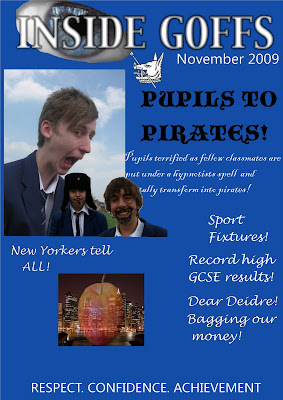
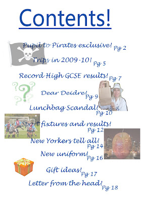
I posted the link to this post onto my facebook status as well as sending it to my contacts on MSN. I asked them their honest opinion on them as I wanted the oppurtunity to improve. I recieved good responsese, nice compliments and a few replies on how I could improve which I was greatful for.
" Front page- I love! Busy, colourful, eye catching. Contents page- layout is good, easy to read and locate what you want to look at. Double page spread- Like the font of the title, love the way the main photo is on one side and the writing on the other and the way you've pulled out a quote right in the middle."
"I think it's really good..If it was me I would have made the contents page a bit more colourful or something"
"I really like it, it looks great, I think it could definately be made into a real magazine."
"It's fairly good however the contents could do with a background or a bit more colour, it's a bit boring."
I took what my audience had to say on board and on the final cotents page I added the green boxes around the sub-headings.

Saturday, May 8, 2010

Question 1

Question one: In what ways does your media product use, develop or challenge forms and conventions of real media products?

My media product, music magazine front cover, contents page and double page spread follows conventions of existing music magazines. I decided to follow some of the conventions and challenge others, this is because the way they are laid out help them sell to there audiences and to go against these conventions you are possibly jeopardising your market. One convention I didn’t follow was the size of the magazine I used an A4 sized piece of paper where as magazines use the same width of paper as an A4 sheet but is roughly a centimetre smaller in length. I simply used an A4 because it’s a very similar size and the measurements were already set into the laptop.
Main conventions I have followed are; putting the masthead horizontally along the top of the cover, the reason the mastheads are typically along the top are because it catches your attention in a shop when all the magazines are on the shelves the top is clearly visible and as its at the top its typically the first bit you see, However some issues of magazines have their main image covering the masthead, this is simply because the house style is easily recognised to those who buy the magazine, I haven’t followed this because my product is the first of its kind therefore people need to know what the magazine is called in order to become familiar with it.

Magazines nearly always have one main large image taking up a large percentage of the cover. I have followed this convention using a large image which takes up the cover. The style of shots used in covers varies a lot. There is not set convention, each leading magazine such as Kerrang, NME and Q use a variety of shots on each issue however there tends to be favourites used, Q are a fan of long and mid shots shots, NME are in favour of mid shots and close ups and Kerrang are in favour of mid shots and close ups. Mid shots are usually taken from chest upwards however sometimes are taken from waist up, these aren’t long shots because you can not see the entire body. My cover follows the shot style of a mid shot, I took the picture from just under the chest upwards. I did this so the models face would be in the centre of the magazine cover. It’s the main focus.

Looking at several copies of existing magazine covers the number of smaller images vary. Some covers use images of posters that are featured inside the magazine, such as Kerrang’s Panic at the disco and Green day issue seen above. Posters featured inside the magazine is a great selling point for both sexes of their audience, for the females posters of your favourite bands, or bands you like the physical appearance of can be hung onto your wall. And for the males it can be seen as an inspirational target or dream to be as successful. Not all posters are of male artists posters of Hayley Williams from Paramore can be hung onto guys walls too. This convention is only really seen on Kerrang covers.

What Kerrang and NME do use are footers and headers, I haven’t used these because what’s inside the magazine is placed down the right hand side of the cover. Also often used in magazines are pugs, seen above featured in NME and Kerrang. Once again I was unsure of where to include any and what would be written inside them, so therefore left them out, I didn’t want my cover to look crowded as it was the first of its kind.
Front covers have the barcode, date and issue number present on the cover, often surrounding the barcode. I followed this convention but also to emphasize that it’s the first issue of the magazine I have written the issue number at the top of the page.

I found constructing a contents page the most difficult out of all 3 tasks, because you can look to existing magazines to see how they lay it out but there aren’t many variations you can use. I looked at contents pages from Kerrang, NME and Q as these are the 3 top competing magazines. One convention I followed that is present inside Kerrang was a little letter from the editor simply to welcome the readers to the magazine and informing them what days the magazine is sold and the aim of Launch! Every music magazine breaks down there contents page, they use several subheadings.

Kerrang breaks down the contents into sub headings some headings appear in some issues but not in others the main headings that appear in every issue are ; Feedback, News, Live Reviews, Features, Album reviews, gig guide. Other breakdowns present in some issues are Poster special, Famous Last Words, Swag. Content under each heading descend in numerical order. NME break down contents page in a similar way subheadings typically consisting of five subheadings as seen above also seen above the use of a band index, this is helpful to those who are interested in only certain artists

Question 2

Question 2: How does your media product represent particular social groups?


To represent my particular social group I used a colour scheme of purple and green. The green represents being new or inexperienced and the purple represents elegance and its uncommon in nature, these are ideal for my audience. These colours will attract my social groups as genres such as punk and alternative can be identified with bright colours drawing them towards the magazine. These colours are on my front cover, continued onto the contents page and double page spread this was to keep to the colour scheme and house style.


The age of my model also attracts the social groups as she is young targeting a young audience, she’s a pretty female, also unknown in the world of music which intrigues the buyer, her outfit of a black corset with red indicates sassiness and passion, the corset can often be worn by punks and people who dress alternatively to others. The eyes are focused on the camera catching your eye and drawing you in, the model isn’t pulling a particular pose for example I have witnessed in an RnB magazine the male model has a clenched fist in the fashion of “respect”. The language isn’t particularly grammatically correct, it’s written in the style of a teenager but not too simplistic. This is demonstrated in my double page spread. Along with the language the font I used changes on the cover contents and double page spread but is consistent throughout each page. For example I used Lucida Handwriting on the cover except for the masthead, on the contents page I used Meiryo, it’s easy to read off of and slightly plain, I also used this colour on the spread but alternatively changed the colours from green to black, making the page more exciting also splitting the article up into question and answers, as my audience don’t typically like to read pages of writing.

Question 3

Question 3: What kind of media institution might distribute your media product and why?

My a magazine to be distributed a publisher has to be discovered that works best for the magazine. Magazines Q and Kerrang are published by a large German publishing company Bauer founded in 1875. The company’s headquarters is in Hamburg but operates in 15 countries worldwide. Even though the company publishes two magazines that feature the same genres as my magazine publishing three of the same may be a strain. NME is published by IPC Media as well as publishing over 80 other consumer magazines.. These companies are well known in the media industry and for my magazine to be successful I would have to choose carefully to make mine successful. My magazine will be distributed by a variety of media institutions this is because it targets a large market, to teenagers anywhere in the country as it features more than one genre of music so the market is broader. It will be creating a large profit to institutions selling it. Big shops such as WHSmiths would stock large numbers of my magazine as it is a well known store that has a large variety of customers. My magazine is similar to Kerrang and looking at different media distributes its sold in many places such as Tesco’s and other large supermarkets, WHSmith’s, Newsagents and magazine kiosks. The magazine can be publicised on the internet and therefore can be mail ordered, as a lot of people use the internet to buy things. As the internet is a useful place to order products I have included a subscription on the contents page, alerting the reader that they can order it online in the comfort of there own home.

Question 4

Question 4: Who would be the audience for your media product?

The audience for my magazine are males and females who listen to a variety of music from rock to metal to alternative and punk music. These are my target audience as they are the genres that would be featured inside, therefore there is little point in targeting people who listen to pop on the cover, when the music inside is completely different. There are no boundaries on the age of my readers however the main market of music magazine buyers are 15 to 19 so I will be aiming towards them in this case careful decision on colour schemes needs to be in consideration. This is the ideal audience however the magazine may appeal to other people who are interested in one particular band featured inside an issue.

Question 5

Question 5: How did you attract/address your audience?


To attract my audience I researched into other existing music magazines and what features attract there audiences, I created a questionnaire asking the market these magazines target, what they liked and didn’t like about a select few magazine covers. Feedback showed me that majority of people answered the familiarity of the product and who makes it attracts them to the product. For example people buy a product from Cadbury because they are familiar with the brand and trust it. A feature that scored low was the use of celebrities highlighting the fact that my target audience are not immediately interested by the artist, creating a great market for new undiscovered artists. I then proposed my ideas and had them answer questions on what ideas they liked better, as my aim is to target this audience you have to use their opinions when creating my product. Features that attracted my audience are the colour scheme, main image and text. To target my audience I first took a look at colour schemes used in these existing magazines, I decided to use bright alternating purple and green colours as it draws your attention in and was favourable by majority on my questionnaire. I asked a few participants why they answered green and purple and they replied that “they contrast well together they’re quirky and purple is a good colour.” The font attracts both my male and female audiences because these two colours are neither very girly or boyish. Both colours are appeal to both sexes. Both colours do not represent a distinctive sex like pink is stereotypically used for girls and blue used for
To keep the audience interested I kept the colour scheme running throughout the contents page, the background is plain so it does not subtract attention from what’s inside. The shade of the colours are identical to the cover. The page numbers are in green with the win box in purple. The green boxes surrounding each subheading is a new edition to the finished page. This is because I sent my finished work around my target audience and asked them what they liked, didn’t like and what I cold improve and the feedback suggested that the contents page could do with something extra, some suggested a background to be used. After this feedback my initial idea was to fill the background in one shade of a colour and then use the gradient tool to emphasize areas. However with the green and purple already being used on the page using these colours as a background would make certain parts blend into the background, and changing the background colour would throw the colour scheme out the window. So I asked my teacher and he suggested a simple box round each subheading would give the contents page that little boost as having the idea of the white background was good as it is clear to read off of. Little adjustment but made the page more colourful and sticking to the colour scheme drawing equal attention to every feature.


Question 6

Question 6: What have you learnt about technologies from the process of constructing this product?

The first technology I used in the process of constructing my product was the internet to create my own blog, however I already hit my first complication which was that a year or so previously I created an account, which I had to send my forgotten password email to my hotmail account to which I then accessed and deleted my original blog so I could create a new one. Once I complete this the next piece of technology I used was my camera in which I took pictures for my preliminary coursework. I took a lot of photos as I had wiped my memory card so it was empty in order to take as many pictures as possible, recieving a better result than only having 10 picture spaces left to take good photos. I used my own 10.0 megapixel digital camera as I am familiar with the settings and it takes good images.


I however didn’t have a scanner handy to scan in my design ideas so I simply took a picture of them and uploaded as a simple idea and created neater versions on paint. To upload the images I took on my camera I used the lead that is compatible for uploading on machines and also the memory card reader that was provided by the school, I swapped many images onto my memory stick so I had them on more than one portable device in case I forgot or misplaced one for the lesson I needed them for.


A tool I used on the creation of my product was the changing of the brightness and contrast of my colours, making some brighter or darker depending on the image and where I was placing it.


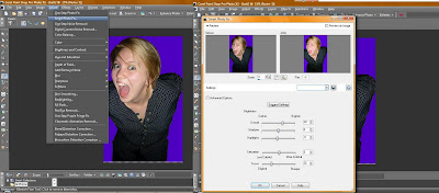
The only other tools I really used are the eraser, blemish tool, crop tool and copying and pasting into new layers.


A problem I found was that my memory stick was quickly filled up with work quickly so had to often uploaded other subjects work onto my laptop or computer at home creating enough space for media as image sizes are large especially PSD files for example one PSD image of my double page spread is 62.4 MB. A major thing I have learnt from the process of creating my product is to continuously save my work as on several occasions the apple macs photo elements programme shut down and I was unable to recover my work, this same problem occurred on my laptop so I learnt to save after every new bit I added or changed. once I overcame this element the use of Photoshop was relatively simple as I have a similar programme on my laptop. A new website I have discovered through this work is http://www.dafont.com/ where there is an entire library of different fonts.

Question 7.

Question 7: Looking back at your preliminary task, what do you feel you have learnt in the progression from it to the full product?


Looking back on my preliminary coursework I feel that I have learnt a lot. Mainly I've learnty to use one large main image on a front cover rather than several smaller images, each indivdual image recieves equal amount of attention, nothing really grabs the readers attention. The larger the image the less block colour is visible. I've learnt that it doesn't take much to make one colour look more interesting by using the gradient tool, this added element on my cover would grab slightly more attention. Another problem with the colours on the cover are that they all blend in and they are boring. I've learnt that the layout would look better with the title of the main article going across the image and the page rather than down the side of it on two seperate lines. If I had done this the image could be larger also on this part of the page I accidently saved the file into a JPG while some of the text was hidden behind one of the images. Therefore I have learnt to save the file in a JPG is I think it's finished as well as saving it as a PSD so if any mistakes were spotted I could correct them. This did happen with the final product the last digit of the date went off the page and the file was saved in a JPG so I had to cut and paste the background which was a long process just to change one detail. The colour of the text down the right hand side of the page could have done with being in more interesting colours, even alternating colours to attract more attention.
I've learnt to cut images out much better, after the creation of these, a good way I learnt to do it was to use the eraser tool that doesn't just erase the background but can also erase layers, this came in really useful. I've learnt to piece pieces of the cover together better than just listing them for example "New Yorkers Tell All" doesn't look as thought its with the image which it should look as they are part of the same article. One other thing that I learnt, is to print the date much smaller. An item I am fond of on the cover is the positioning and font of 'Respect. Confidence. Achievement.' It represents our school well along with the schools motif, this is good in my opinion as the idea of the coursework was to design a magazine for your school. I feel I have progressed far from this piece of work to my final product.
I personally don't mind my contents page, I like the idea I had of listing the contents down the centre of the page with the page numbers next to them, however this will only really work with little contents otherwise the size of the font would have to be decreased to fit it all in. The overall look of the page is too faded, this was because some of the text overlapped the images so I decided to fade all the pictures to keep the look consistant. The editing around one particular image on this page is poor, but now I feel that I am more confident and able to edit around images. Also the idea was to take photographs yourself but I used the internet for a couple, which in practise if this was my actual marked coursework would have been deducted marks.
Overall I feel I have come along way from the beginning of the course to the end. I've learnt the ins and outs of photoshop, technology involved in making the product such as saving work in many places, on memory sticks, Macs at school and computer/laptop at home.

Editing

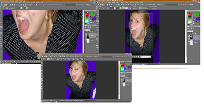
Editing part of my double page spread.


Images.

To begin to construct my products I needed to take lots of pictures, as the more pictures I took the better my chance at finding the right picture, it's better to have too many than too less.


Two of these pictures feature Nickelback on the top however if I was to use this I would probably edit it so it was not visible as the model featuring on the cover is an artist herself.
For my front cover I took pictures from a mid shot to closer up shots as this was my prefered shot according to my audience who filled out my questionnaire.

I found that neither of these two shots i narrowed it down to the angle the photograph was taken doesn't would conventionally be seen on a front cover, these are unedited photos as one is really pale I would have added colour to the cheeks. Therefore the style of photo I decided to use is the image you can see on the cover. The image below is the original photo. In total I took around 60 photos for my front cover.


The double page spread pictures were taken on a trip up to London with some friends. I took several pictures of the 3 guys together.
Pictures taken are the ones that are featured in the magazine others that didn't capture the light properly, as I was taking pictures of three people they all have to be ready at the same time for the photo, as I found on some occasions two were ready and posing/smiling and the other was not.
This is the original photograph before being edited of the band. Befiore I cropping and editting it. The idea of the layabouts came from a day at school, when some friends were playing around and I ended up taking a photo of them holding a friend up.

Following this I took the pictures which demonstates two out of three were ready.


Once the photos were decided I had a look on Dafont.com and browsed around the library of fonts on there. I print screened any fonts I liked and pasted them into paint.


For the conents page I didn't take that many photos I simply used existing photos I have taken on days out with friends, parties and concerts as I feel that they are suitable to the use.

Thursday, March 11, 2010

My Contents page ideas:

Ideas two:

Ideas two: Contents is once again in large font in the top right hand corner. There is one large image taking up a large percentage of the room. The image placed inside this box is still to be decided, in relation to the front cover, which is a mid-shot image I can’t repeat the same shot in the contents this doesn’t provide much variety. Showing little capability of taking various shots. Therefore the shot will be either a log shot or a close up, either those two or a mid-shot of a band. Down the right hand side of the page there are subheadings such as ‘news’ and ‘gigs’ listing the articles in numerical order in the order they appear in the magazine. This is easier for the reader to turn to the categories they are attracted to. Along the bottom of the page there will be an offer on music merchandise, next to the offer there will be a box for the reader to subscribe to the magazine for an ideal cheaper price as it is the first of ever issue of the magazine.

My Contents page ideas:

Idea one:

First idea: Contents in large font on the top right hand corner. Issue number under the contents heading. There are 3 images going diagonally down the page starting in the left hand corner. One of the images will be an image of one of the posters that’s inside. One smaller image between 2 larger images. To keep with the messy teenager concept there will be headings scattered all over the page, with articles listed underneath them. Headings consist of ‘News’, ‘Reviews’, ‘Gigs’, ;Interviews’, ‘Who’s New’, ‘ Win, Win, Win’ and ‘Quizzes’. Depending on the chosen front cover idea depends on what the colour scheme the contents page will be.


My ideas for my front cover: ME! (Musical Evolution)

ME!

IDEAS 3: This idea is similar to the first idea.

Masthead: ME (Musical Evolution) the name centre on each individual, making them selves’ feel more important an boosts self-esteem. It’s similar to the NME style acronym, which may confuse readers. The style of music will be similar so disappoint may come from dedicated NME readers who may feel this new magazine is trying to over ride the existing mag. It represents my audiences taste in music. Just like the letter from the editor in Kerrang! It personalizes the magazine.

IMAGE: Will be a mid-shot of my model, wearing dark eyeliner and red lipsticks they contrast each other well. Depending on the pose chosen the colour of lipstick maybe dulled down a little so the eyes grab more attention she will have messy hair representing the rocker image. Also she will be wearing a deep plunge line top revealing her cleavage.

COLOUR SCHEME: Black and green. The first band I think of with the colour black and green are GreenDay. Black is a basis colour it contrasts well with any other colour it symbolises style, power and sophistication. Green represents growth and being new or in experienced which is ideal for the content of promoting up- coming bands. Also represents youth and good luck. These colours are good to use as they do contrast well, they are striking and eye catching.

DESIGN: The masthead will be ME! And be in the centre of the top of the cover. For a new magazine I want my readers to familiarise with the company before following other existing magazines and cover some of the masthead with an image. There will be one main image taking up 70% of the cover slightly off centre, more to the right. The image will be on a background from London, such as Camden Market, it’s an exciting location. Along the left hand side will be neat line up of boxes alternating colours green and black. Each pug will contain something that will feature inside the magazine. They will include main articles as well as sub articles along with a few pictures. There will be a ‘NEW!’ in the top left hand corner to show the audience it’s a new magazine. As well as ‘Issue NO. 1 and the date.

LANGUAGE: Just like the other magazine ideas, the language is going to involve a slight bit of simple slang to show the audience that the magazine is current and up to date with the times. Which will appeal to the audience, it will not be patronising or incredibly grammatically correct, as I feel that this detracts from the over all image of ‘Rock n Roll’.

I like this idea for my front cover, it will be easy to create the predominant image. The style with the neat boxes does not reflect my target audience of being messy teenagers.


My ideas for my front cover: ALTERNATE.

Alternate:

IDEAS TWO: Masthead Alternate, this suggests that you deviate from normal society and change things up or you don’t follow the crowd. This is ideal for my audience, however more people listen to rock and alternative music than a few years ago, this especially for punk music.

Once again the masthead will be along the top of the magazine, following the conventions of other magazines.

IMAGE: A selection/collage of pictures of artists featured inside the magazine and magazines to come. I think this is a good way to kick off a new magazine and demonstrates the genres of music present. The cover would have artists in boxes instead of cutting round each person and overlaying each other.

COLOUR SCHEME: Red and blue these colours will be along the masthead and alternating font colours, this sticks with the masthead of alternating. A few of the boxes will be highlighted with either red or blue just to emphasize the colour scheme. The red represents danger and passion where as the blue contradicts this as it is a cool calming colour. Making the overall colour scheme neutral.

DESIGN: however this design will be mainly of the background image with few bits of texts. The text used will be in matching boxes to the images and writing across a few images, so the image is clearly visible. Little text will be used to give the image the full effect of variety. I don’t want to overpower the cover by putting too much into it.

LANGUAGE: The language is going to involve a slight bit of simple slang to show the audience that the magazine is current and up to date with the times. Which will appeal to the audience, it will not be patronising or incredibly politically correct, as I feel that this detracts from the over all image of ‘Rock n Roll’.

I feel this is a good idea, however as the criteria lists you have to take your own pictures it will be very difficult to take a large amount of different pictures, around twenty. So I don’t think I will be using this design.

My ideas for my front cover: LAUNCH.

Launch:

MASTHEAD: My first idea for my masthead is Launch, this is because its eye catching and you can emphasize the name. According to the dictionary it is said to be used to set something off for the first time to the public ‘launch the new perfume’ but in this case it would be to launch a new band, as a large proportion of the magazine will be filled with undiscovered bands trying to break into the market. Following conventions of other mainstream, or in fact nearly every magazine the masthead will be along the top of the magazine. This position has been used for a long time. When on the shelves the top of the magazine is always visible on the racks, drawing peoples attention.

IMAGE: A friend covered in eyeliner, quite pale skin, simple lip-gloss so doesn’t take attention away from her eyes which will be looking deep into the camera in a trance sort of pose with lips pressed together, or bright red lipstick as its st

riking a passionate colour also represents danger, which can connote it’s dangerous to think you have a chance with her, or she’s drawn to danger which makes her more appealing to those rockers who ‘live on the edge’. Her outfit is undecided at the moment but it will be kept simple with dark colours keeping to the rock image, as well as being a sexy colour, its dark and mysterious. Which makes the reader be intrigued to who this girl is, I’m using a girl model as my magazine targets both the male and female audience, it’s appealing to see a sexy girl on the cover of a magazine which consists of there favourite music. Also girls can aspire to look similar, with tips on how to look like a rocker and money off eyeliner. It will either be a close up or a midshot where you can see part of her outfit.

COLUR SCHEME: One initial idea for my colours is black and purple. However now looking at the predominant image I’ve decided that the purple and red colours would clash and subtract attention from the models lips, also however if I decide to go with simple lip gloss I would choose the purple. Black and purple contrast well. Also I’m going to add green to the colour scheme, this will make it more boyish as the purple was quite overwhelming, green it’s easy on the eye and represents growth and being new or in experienced which is ideal for the content of promoting up- coming bands.

DESIGN:

Masthead along the top, posters down side, image 70% of page centre, pugs in different shaped boxes scattered around, not in a simple order down a particular side of the posters down the left hand side. 3 fit nicely and are not stretched like they cover, as the main age range of my magazine tend to be un tidy and a bit every where. Three would be if only 2 posters were available. ‘NEW’ will be in the top right hand corner along with the price as it catches your eye and reveals it’s new and affordable. The price is between £1- £2 as this is the price my questionnaire results conjured up.

LANGUAGE: The language is going to involve a slight bit of simple slang to show the audience that the magazine is current and up to date with the times. Which will appeal to the audience, it will not be patronising or incredibly grammatically correct, as I feel that this detracts from the over all image of ‘Rock n Roll’.

I like this idea it’s a catchy masthead. I think it will appeal to both audiences, however my second questionnaire will clarify if they think so. I might have to cut back a bit on the amount of purple used or use different shades to appeal to the male audience.

Tuesday, March 9, 2010

First issue of existing magazines

To help me understand what a front cover needs, I researched into 3 existing magazine companies and there first ever issue of the magazine these were Kerrang!, NME and Q. Kerrang!'s first issue was published and released on June 6th 1981. Q's was first released in 1986 and NME which has been published weekly since 7th March 1952.


NME has gone through many drastic changes as it started out as a large Newspaper magazine. It was in black and white, it was the first of its kind and only on the 14th november 1952's issue is when the first ever singles chart was released inside. It has four images on the cover each sharing a relatively equal size space. There's little space for text or articles to be attached to the images, there's a little article attached to te first image, however any other article is seperate and inside an indivdual text box.
When NME was first released it wasn't written as an acronym, this gave the audience time to familiarise them selves with the product. Starting off the conventions of magazines the Masthead is in the middle at the top of the page, standing out, everything below it is written by them, etc. Bold fonts in text boxes stands out and catches your eye as colours were not used at this time. Drastic differences have developed over time. An issue published in December 1978 is the first we see the acronym NME being used, a good 26 years after being on the market.

Friday, March 5, 2010

Questionnaire results

To collect my questionnaire results I used both the blog and handed out written questionnaires. I used both these methods because it if often quicker to fill out a questionnaire if you are already online on a website such as Facebook, this site is extremely popular with my target audience. therefore i frequently posted links onto my status asking my friends to fill it in. A problem with this method is that I found people only fill in part of the questionnaire then either get bored or distracted and leave it half filled in. Therefore to hand my questionnaire out to people means they have to fill it in there and then, this cuts back half filled out questionnaires as I can check them. An overall problem with questionnaires is social desirability bias. This means that people don't fill in questionnaires out properly they tend to make themselves look better, also with pressure to fill in the same answers as your friends , for example if you buy a magazine every week but your friends only buy them when they feel like it you feel more obliged to say you do the same. However this is simply the easiest way to collect results. I added the results of the online questionnaire with the questionnaire I handed out together and obtained the following results:

1. Gender:
15 males 10 females

2. Age:
14 - 1
15 -0
16 -9
17 - 11
18 - 1
19+ 3

3. Occupation:
Student - 15
Student + part time job - 6
Part time job - 2
Full time job - 3

This shows that my ideal target audience are aged betweem 16 and 17 years old, both male and female. They are students with no income except for either pocket money/ paper round/ EMA/ or part time jobs, relating the fact that the price of my magazine has to be affordable to draw in the readers.

4. Often buy magazines:
Yes- 4
No-2
Sometimes-20

5. How often:
Once a week-
Twice a week-
Once every two weeks-4
Once a month-9
Other- (every 3 months- 1)(when I can be bothered- 11)

These two question results show that magazines are not an often buy for the average teenager, as 20 selected they read them sometimes. This means that for your particular issue of a magazine to be bought it needs to catch the eyes of potential buyers either by colours or images.

6. Attention:
Familiarity-13
Reputation- 7
Masthead- 7
Celebrities- 8
Freebies- 9
Other- ( cover- 1)

The company that produces the magazine should be a trusted distributor of media products for example if Cadbury was to release a new product the likely hood of someone buying it is largely increased as the brand is known. This also goes for the reputation. The front cover is the only bit visible in sight therefore it has to catch attention any way possible.

7. Price:
>£1-2
£1-£2- 10
£2-£3- 12
<£3-1

As my target audience are largely teenagers the price of the product can not exceed expectations or margin higher than what the majority are willing to pay as you would loose readers. Therefore my product will be priced at £1.50. £2-£3 is the maximum price people would pay increasing chance of buyers if the price is lower than they expected as we have seen previously many are unemployed.

8. Genre:
Rock- 13
Metal-2
Punk-5
Indie-17
Pop-13
RnB- 10
Dance-9
Garage-4
Oldies-10
Clssical-1
Any-1
Other-1

9. Number of genres:
One type-3
Mixutre of two-13
Complete mix-8
Other-1

These questions were important for my products research as the type if music that features inside a magfazine is important for example metal music alongside RnB music in one magazine wouldn't work as the two genres do not coincide with each other but instead clash. My original idea was to have a mix of at least two genres. The results collected demonstrate that this is what the majority of my audience are after.

10. Turn offs:
Not attractive-1
Too much content-1
Price-16
Too many colours-6
Adverts-2

These answers help me to understand what not to do with my product in order to target a broader audience. The main concern people have is the price, it has to be correctly priced in the markets opinion to be considered a purchase which is understandable as often teenagers do not have a lot of money to spend.

11. Feautes:
Artists-15
Posters-7
Quizzes-8
News-13
Competitions-1
Letters from readers-1
Reviews-7
Festivals-5

This question was in aid of my contents page to research into what headings and subheadings would appeal more. Typically the artists inside won the most votes as these are who they are going to be reading about. Which follows onto the second highest answer of news. People who buy the magazine want to know what their favourite artists are up to and what's coming up next for them.

12. Layout:
Centred main image with text around-9
Centred main image text above and below it- 4
Centred main image images and text above and below-12

The most popular layout of centred image and images and text above and below is becuase it gives the reader more to look at, more items grab the readers attention.

13: Style shot:
Mid shot-18
Long shot-1
Midlong shot-2
Close up-4

Mid shots are popular as its close enough to see emotions on the models face, you can see part of the outfit and the image is nicely positioned in the centre of the cover with enough room either side.

14: Colour schemes:
Purple and Black-10
Black and White-5
Black and Green-2
Red and Blue-3
Green and Purple-5

The most popular colours are not suprising purple and black is a good choice as they contrast nicely together black is used a lot in magazine as its a dark colour its striking and it can be contrasted with nearly any colour.

15: Masthead:
Launch-10
Alternate-6
ME-9

These results were close but i'm glad that Launch won by one point as it was my favourite choice because the masthead represents what my maazine would be about.

Wednesday, February 24, 2010

Camera shots:

Magazine front cover ideas: For a front cover there are typically 3 types of shots used these are; close ups, mid shots and long shots.
I can use a close up, this obviously expresses emotion, in this particular shot you can express a genre by make up, such as dark eyeliner, for a rock look or a lot of bronzer and mascara for a RnB look.


A shot i could use is a long shot, this focuses more on the body language and outfit than the expression. The person(s) on the cover in this type of shot, are often always up to date with the latest fashion (within that genre) as it's a strong influence on the audience.
This idea for my cover consists of a mid shot of my model. This will enable my audience to see the emotion on there face, but also see enough of them to observe there outfit, as image is also important in any magazine but less so in rock and roll magazines which is the type of genre I'm aiming for.


Tuesday, February 23, 2010

Questionnaire

After researching i decided to see how my target audience felt about my decisions such as the ideas for my magazine, so it appeals to a large audience. This was carried out by printing copies off and handing them out to a variety of girls and boys in similar age range.

Questionnaire.

1. Are you male/ female?

2. How old are you? ………..

3. Occupation…….

4. Do you read magazines often?

Yes/ No/ Sometimes.

5. How often do you buy magazines?

Once a week/ twice a week/once every two weeks/once a month/ other, please state……..

6. What draws your attention to a new magazine? (you can circle more than one)

Familiarity of the magazine/ reputation of magazine/ Masthead/ Celebrities/ freebies.

7. How much are you willing to pay for a magazine?

Less than £1/ £1- £2/ £2- £3/ more

8. What music do you prefer to listen to? (you can circle more than one)

rock/ metal/ punk/ indie/ pop/ RnB/ Dance/ Garage/oldies/ other please state……

9. Would you prefer a music magazine based on..

One type of genre/ mixture of 1 or 2 genres/ complete mixture

10. What puts you off buying a magazine? ………

11. What features do you prefer in a magazine?

Artist’s inside/Reviews/ Posters/ Quizzes/ News/ other please state……

12. Which layout do you prefer? (please circle)

13. Which shot would you prefer to see on a front cover?

Close up/ extreme close up/ mid shot/ long shot/ mid-long shot

14. Which colour scheme do you prefer?

Black and white/ Purple and black/ Purple and green/ Black and green/ other please state…..

15. Which masthead (title) do you prefer?

Alternate/ Launch/ME (music evolution)/other please state…..

I didn't include my own ideas in this first questionnaire simply because I wanted to see what they thought about existing magazines before I publish any initial ideas for my own. I have collected back the data and from the results I will hand out a second questionnaire with my ideas on.


Thursday, February 11, 2010

Ideal Target Audience.

This is Tom Whitehall, he is 17 years old, and lives in the town of Slough, just outside London. He lives with his parents and two brothers n a four-bedroom house. He attends his schools sixth form, where he studies Psychology, Music, Media and History.

He dresses fairly straight forwardly - usually jeans sometimes skinny jeans, pair of Vans a printed top and large hoody.

He enjoys skateboarding, playing guitar and playing the Xbox 360.

He usually shops at Topman, in Camden Market. He also shops a lot online on websites such as Rockabillia.com and loudclothing.com.

He enjoys listening to a variety of music. Such as Bullet For My Valentine, Disturbed, Godsmack, Linkin Park, Avenged Sevenfold. He’s also into Dance and Trance music. He downloads these but also often buys them on CD. He also likes to attend festivals such as Reading festival, Leeds Festival, Glastonbury. Favourite radio stations are Kerrang, Xfm and Scuzz.

He also enjoys watching TV programes like Family Guy, South Park, Miami Ink, LA ink, Futurama Scrubs, Two and a half men. Plus music channels, Kerrang, MTV. Along with watching films, he likes horrors, thrillers action and comedies.

I think my magazine would appeal to Tom because it will consist of the same music genre, including Linkin Park and Bullet For My Valentine. It will display up coming events, gigs and festivals. Also include pages on tattoos, and game reviews.

My magazine will target the both genders male and female, there will be aspects for both sexes, such as gaming insights for the guys and tips on how to get the rock chick look for the girls. As well as features such as reviews, interviews, news and upcoming bands and festivals for both to enjoy.

The magazine genre would be classed as alternative Rock, this consists of many sub-genres such as punk, rock and indie.

Maslow's Hierarchy of needs.

Looking at Maslow’s hierarchy of needs you can clearly see the things in life that are needed for basic survival these are referred to as physiological to self-actualization such as acceptation of fact. This along with the Uses and Gratification model and Demographics show who to target media products such as magazines at.

Each of us is motivated by needs. Our most basic needs are inborn, having evolved over tens of thousands of years. Abraham Maslow's Hierarchy of Needs helps to explain how these needs motivate us all.

Maslow's Hierarchy of Needs states that we must satisfy each need in turn, starting with the first, which deals with the most obvious needs for survival itself.

Only when the lower order needs of physical and emotional well-being are satisfied are we concerned with the higher order needs of influence and personal development.

Conversely, if the things that satisfy our lower order needs are swept away, we are no longer concerned about the maintenance of our higher order needs.In turn this means that media is higher on the hierarchy as it is not a basic need, thought some may feel it is.

Media starts to fit into the model in the higher regions such as Esteem and Self-Actualization. This is when they start to advertise those products once basic needs are fulfilled. They target self-esteem and confidence by their products such as magazines, with the advertising and content reinforcing them. For example a ‘Punk’ kid, who is different and may get picked on in society who reads a punk magazine opens it up, reads through and it reinstates he’s confidence of belonging.

Media reaches further into Self- Actualization when creating and advertising products further. They create the illusion that we need their products, when they are not as necessary. These products consist of news, television, games Internet sites etc.

Uses and Gratification look at ‘Why’ people use media rather than content. The mass media compete with other sources of gratification, but gratifications can be obtained from a medium's content (e.g. watching a specific programme), from familiarity with a genre within the medium (e.g. watching soap operas), from general exposure to the medium (e.g. watching TV), and from the social context in which it is used (e.g. watching TV with the family).

NRS grades.

A

Upper middle class

Higher managerial, administrative or professional.

B

Middle class

Intermediate managerial, administrative or professional

C1

Lower middle class

Supervisory or clerical and junior managerial, administrative or professional

C2

Skilled working class

Skilled manual workers

D

Working class

Semi and unskilled manual workers

E

Those at the lowest levels of subsistence

Casual or lowest grade workers, pensioners and others who depend on the welfare state for their income

The NRS Social Grades, (National Readership Survey) class every occupation under one of these 6 categories.

Aswell as the occupation wages are taken into consideration. Therefore this model is key to analyse your potential target audience.

For most music magazines such as Kerrang, NME and Top Of The Pops target the teen generation. This age range classes as group E as they are students with either no or very little income. In which case media such as magazines market carefully and provide products in which can be afforded. The average price for a magazine is £2 - £4 depending on your acquired music taste. The cheapest magazine is Kerrang at the price of £2.20 and is very popular with teenagers ageing between, 13-17.

Other factors than age taken into account when researching into an ideal audience is gender, age, culture and race. Each magazine targets different audiences.

My ideas.

My target audience will be aimed at social grade E, students. This is because this age range tends to be more up to date with new releases of music. This is a key element for my magazine, as it will be consisting of new and upcoming music.

An idea of a genre of my particular magazine will be a mix between rock and metal, with some alternative bands inside. In which case I will have to be up to date with new releases. Popular and unknown bands to boost knowledge and understanding in the music industry, in turn boosting careers. My magazine will be one new band’s come to help publicise them

This would mean that the price would have to be low budget roughly priced at around £2; this is similar to Kerrang and NME pricing. A questionnaire I will create later is to find out which of the 3 main competing magazines they buy. These will be Kerrang NME and Q (which is slightly more diverse than the others.) This will show me how much money they have to spend weekly on magazines.