Question one: In what ways does your media product use, develop or challenge forms and conventions of real media products?
My media product, music magazine front cover, contents page and double page spread follows conventions of existing music magazines. I decided to follow some of the conventions and challenge others, this is because the way they are laid out help them sell to there audiences and to go against these conventions you are possibly jeopardising your market. One convention I didn’t follow was the size of the magazine I used an A4 sized piece of paper where as magazines use the same width of paper as an A4 sheet but is roughly a centimetre smaller in length. I simply used an A4 because it’s a very similar size and the measurements were already set into the laptop.
Main conventions I have followed are; putting the masthead horizontally along the top of the cover, the reason the mastheads are typically along the top are because it catches your attention in a shop when all the magazines are on the shelves the top is clearly visible and as its at the top its typically the first bit you see, However some issues of magazines have their main image covering the masthead, this is simply because the house style is easily recognised to those who buy the magazine, I haven’t followed this because my product is the first of its kind therefore people need to know what the magazine is called in order to become familiar with it.
Main conventions I have followed are; putting the masthead horizontally along the top of the cover, the reason the mastheads are typically along the top are because it catches your attention in a shop when all the magazines are on the shelves the top is clearly visible and as its at the top its typically the first bit you see, However some issues of magazines have their main image covering the masthead, this is simply because the house style is easily recognised to those who buy the magazine, I haven’t followed this because my product is the first of its kind therefore people need to know what the magazine is called in order to become familiar with it.

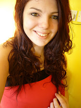
Magazines nearly always have one main large image taking up a large percentage of the cover. I have followed this convention using a large image which takes up the cover. The style of shots used in covers varies a lot. There is not set convention, each leading magazine such as Kerrang, NME and Q use a variety of shots on each issue however there tends to be favourites used, Q are a fan of long and mid shots shots, NME are in favour of mid shots and close ups and Kerrang are in favour of mid shots and close ups. Mid shots are usually taken from chest upwards however sometimes are taken from waist up, these aren’t long shots because you can not see the entire body. My cover follows the shot style of a mid shot, I took the picture from just under the chest upwards. I did this so the models face would be in the centre of the magazine cover. It’s the main focus.

Looking at several copies of existing magazine covers the number of smaller images vary. Some covers use images of posters that are featured inside the magazine, such as Kerrang’s Panic at the disco and Green day issue seen above. Posters featured inside the magazine is a great selling point for both sexes of their audience, for the females posters of your favourite bands, or bands you like the physical appearance of can be hung onto your wall. And for the males it can be seen as an inspirational target or dream to be as successful. Not all posters are of male artists posters of Hayley Williams from Paramore can be hung onto guys walls too. This convention is only really seen on Kerrang covers.

What Kerrang and NME do use are footers and headers, I haven’t used these because what’s inside the magazine is placed down the right hand side of the cover. Also often used in magazines are pugs, seen above featured in NME and Kerrang. Once again I was unsure of where to include any and what would be written inside them, so therefore left them out, I didn’t want my cover to look crowded as it was the first of its kind.
Front covers have the barcode, date and issue number present on the cover, often surrounding the barcode. I followed this convention but also to emphasize that it’s the first issue of the magazine I have written the issue number at the top of the page.
Front covers have the barcode, date and issue number present on the cover, often surrounding the barcode. I followed this convention but also to emphasize that it’s the first issue of the magazine I have written the issue number at the top of the page.

I found constructing a contents page the most difficult out of all 3 tasks, because you can look to existing magazines to see how they lay it out but there aren’t many variations you can use. I looked at contents pages from Kerrang, NME and Q as these are the 3 top competing magazines. One convention I followed that is present inside Kerrang was a little letter from the editor simply to welcome the readers to the magazine and informing them what days the magazine is sold and the aim of Launch! Every music magazine breaks down there contents page, they use several subheadings.


Kerrang breaks down the contents into sub headings some headings appear in some issues but not in others the main headings that appear in every issue are ; Feedback, News, Live Reviews, Features, Album reviews, gig guide. Other breakdowns present in some issues are Poster special, Famous Last Words, Swag. Content under each heading descend in numerical order. NME break down contents page in a similar way subheadings typically consisting of five subheadings as seen above also seen above the use of a band index, this is helpful to those who are interested in only certain artists
No comments:
Post a Comment